
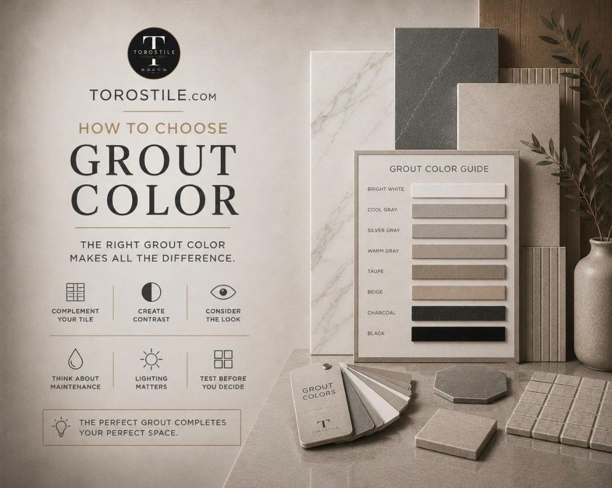
Grout color can quietly support a tile design or become one of its strongest visual lines. The same tile can feel calm, graphic, traditional, or busy depending on the grout beside it. That is why grout should be selected with the tile, not treated as a last-minute installation detail.
Use this guide to narrow the direction before you commit to a color.
Start with the effect you want
Most grout decisions fall into three broad approaches:
- Match the tile: A close color match softens the grid and lets the tile surface, pattern, or overall room carry the design.
- Create a gentle contrast: A slightly warmer, cooler, lighter, or darker grout makes each piece visible without turning every joint into a bold outline.
- Use a strong contrast: Dark grout with light tile—or light grout with dark tile—emphasizes the layout. This can work beautifully with a precise installation, but it also makes alignment and joint consistency more noticeable.
Think about tile size and pattern
Grout has more visual influence when there are more joints. A large-format porcelain floor may have relatively few lines, while a small hexagon mosaic can contain hundreds within the same area. On a mosaic, even a subtle color shift can change the overall appearance.
Pattern matters too. Contrasting grout can underline a herringbone, basketweave, or stacked layout. Matching grout can make those same patterns feel quieter and more textural.
White is not one color
Bright white, warm white, ivory, light gray, and pale taupe can look nearly identical on a small color chip. Beside tile, their undertones become clearer. A cool gray grout can make a warm cream tile look yellow. A warm grout can soften a blue-white marble look.
Compare the grout sample directly against the tile and the nearby countertop, cabinet, or wall color. View the combination in both natural and evening light if possible.
Balance appearance with everyday use
The right grout system depends on the location, joint width, tile type, and installation requirements. Color is only one part of the specification. Ask your installer or product specialist about the appropriate grout type, sealing requirements, cure time, and cleaning recommendations for the exact application.
On floors and other frequently used surfaces, a very light grout may require more visible maintenance than a mid-tone choice. In showers, proper waterproofing, installation, ventilation, and cleaning matter far more than choosing a color that is expected to hide every mark.
Always make a real sample
Printed charts and screens are useful for narrowing options, but they cannot reproduce every combination of tile surface, grout texture, lighting, and joint width. Create a small sample board using the actual tile, selected grout, and planned joint size whenever the decision is visually important.
Allow the sample to cure before judging the final color. Wet grout and newly installed grout can appear different from the finished result.
A practical grout-color checklist
- Decide whether the layout should blend in or stand out.
- Compare undertones with the tile and nearby fixed materials.
- Consider how many grout joints the format creates.
- Confirm the correct grout type and joint width for the product.
- Make and cure a physical sample before the full installation.
- Keep the product name and color information for future reference.
Grout color should make the tile easier to appreciate and the room easier to live with. Bring your tile and surrounding material samples to the Toros Tile showroom to compare a few directions in person, or request a quote for your project materials.